
Banking and finance
Redesign of the Cetelem banking app
The app of a bank that was born for loans and now has to make room for accounts, deposits, insurance and cards.
- Client
- Banco Cetelem · BNP Paribas Personal Finance
- My role
- Senior UX / Product Designer
- Status
- In development (2026)
The challenge
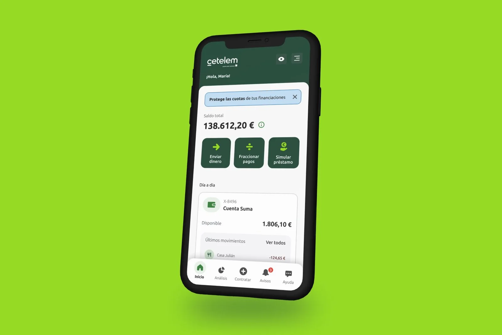
Making room for all of the bank's products and boosting cross-selling without complicating the app for people who only have a loan.
The key
A shared structure where savings and credit live together and that adapts to each customer's products, validated with 8 users.
The result
A new architecture and style for more than 3 million customers. The project is now in development.
The problemSelling without losing clarity
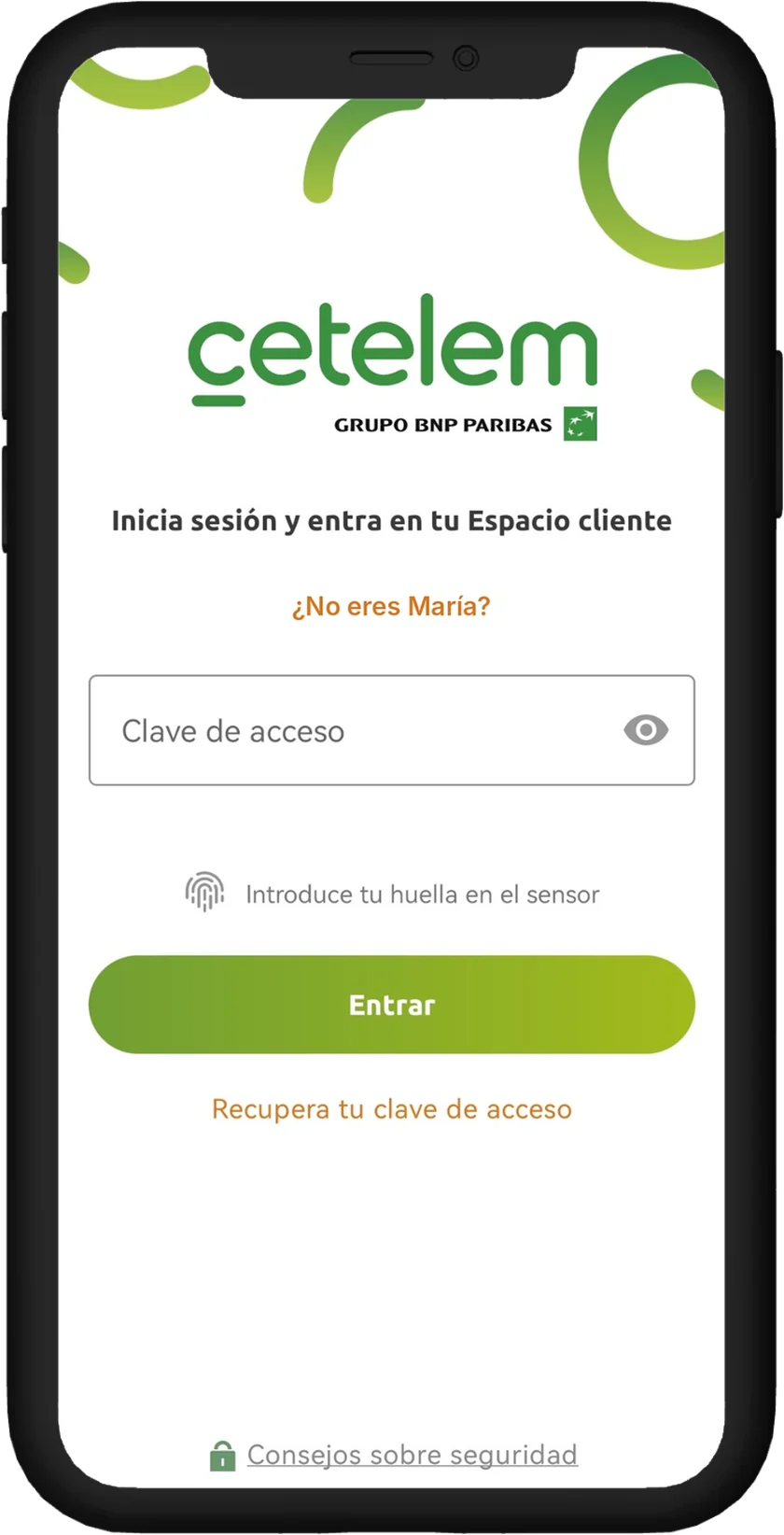
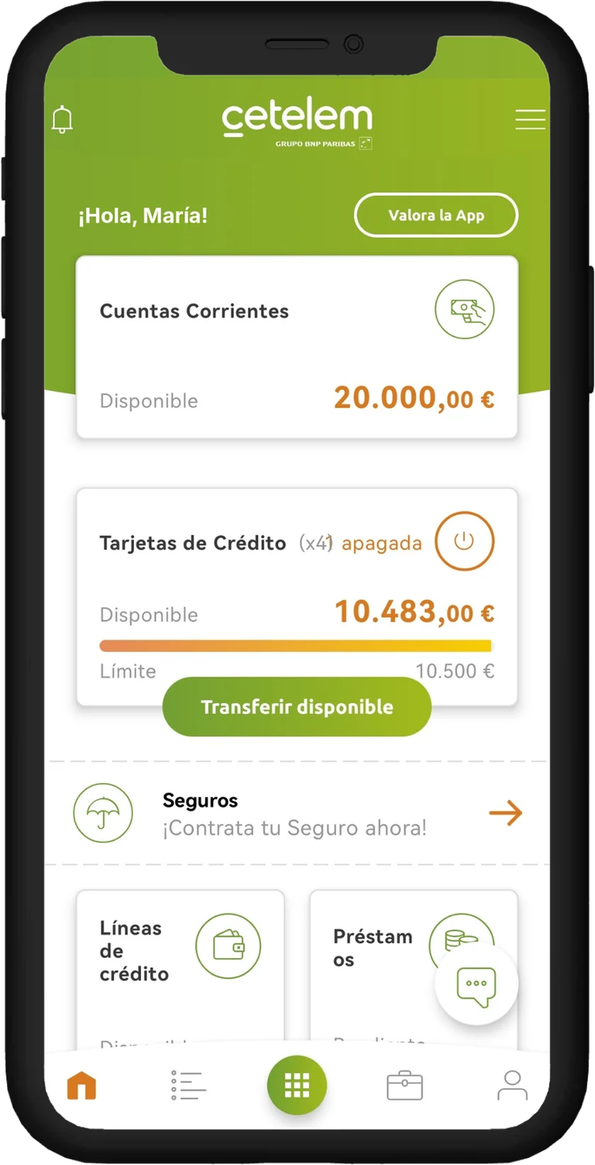
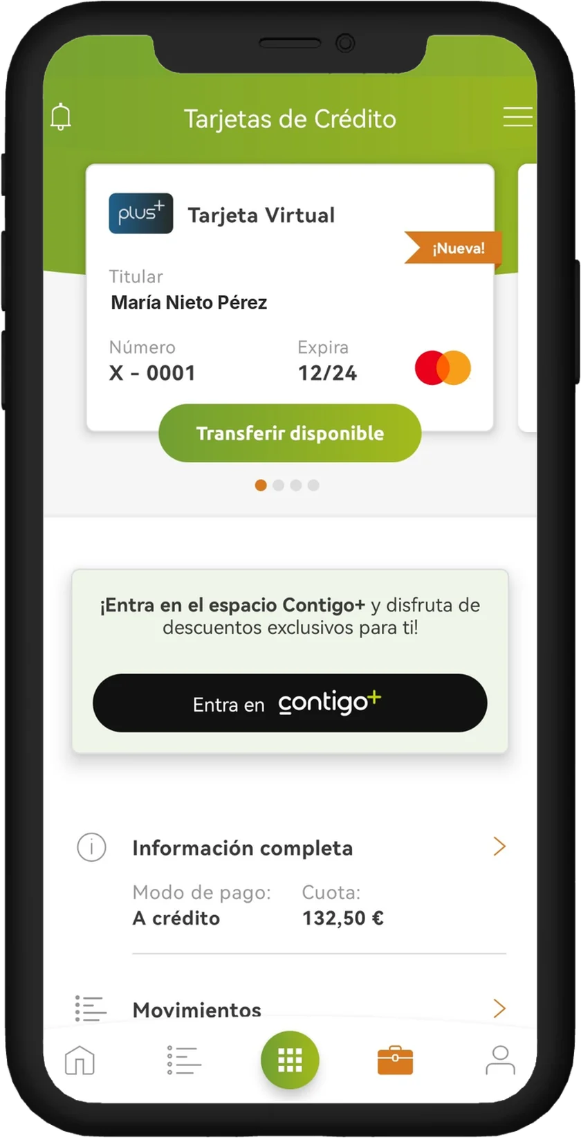
The app's structure, designed for personal loans and eCommerce financing, couldn't accommodate the features of current accounts, deposits, insurance and cards.
On top of that, although credit customers are still the majority, the bank wanted to boost cross-selling of savings products. The app needed a strong commercial character that made new sign-ups easy without complicating everyday use for people who only have a loan.
ProcessHow we did it
I drove and led the project end to end, from research to the final proposal.
Discovery
Analytics, surveys, NPS, interviews and workshops with the business.
Benchmark
Banking and other industries that handled well what we wanted to highlight.
Prototypes
The most-used screens among the majority of users.
Testing
8 users: 4 Cetelem customers and 4 non-customers.
Iteration
A new version based on the feedback from testing.
Development
Current phase of the project (2026).
What we foundKey findings
- The structure didn't scale. The navigation, designed for loans, left no clear place for the new products.
- Mine first, offers later. Users look for their balance and transactions first; offers work better when they appear in context.
- Unclear concepts. Testing flagged features and structures that were hard to understand, which we fixed in the next version.
The solutionAn app that grows without getting complicated
Four decisions so the app can grow in products without losing simplicity.
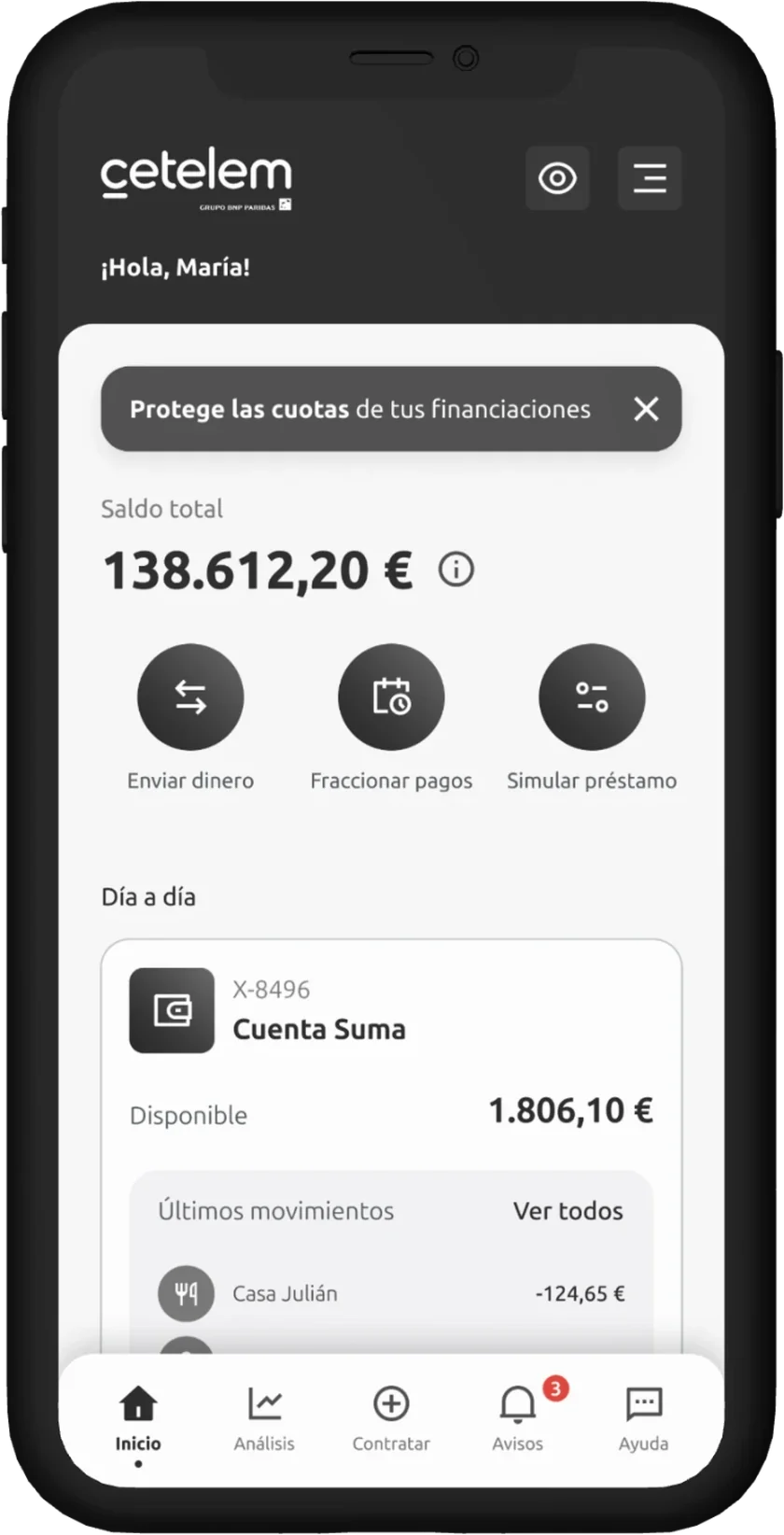
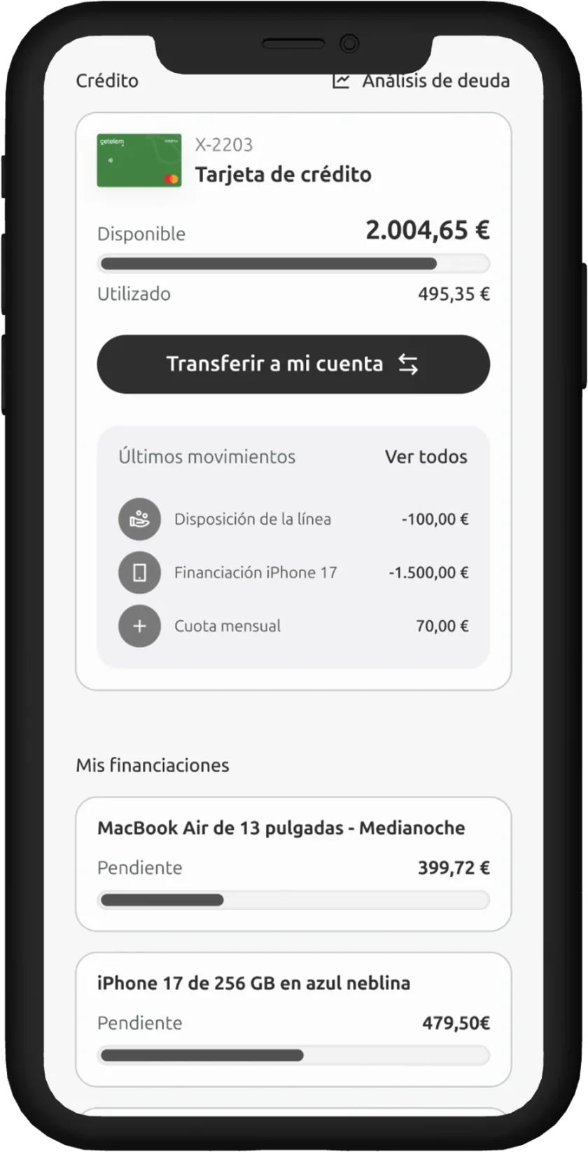
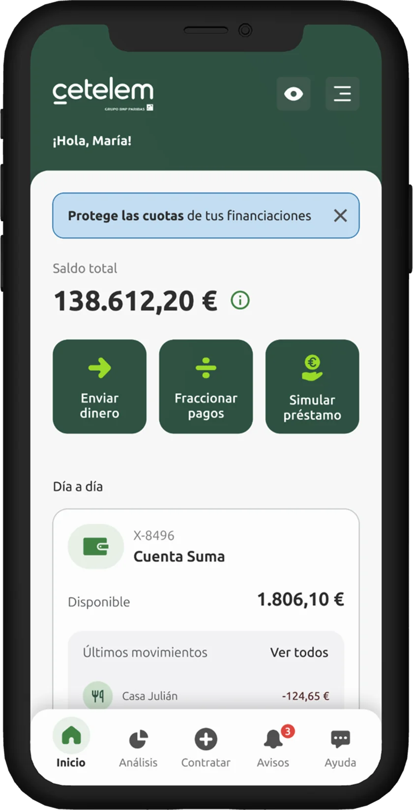
One home for every product. Balance, shortcuts and account and card transactions in a single view, whatever products each customer has.
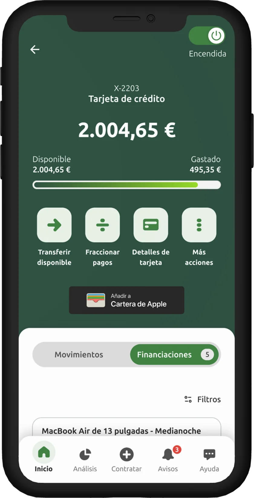
An app that adapts to each customer. Depending on the type of customer and the products they have, the home screen highlights different actions: those with an account see send money; those with a card, split payments; those eligible for financing, simulate a loan. The app is personalized so every user finds what they need first.
Signing up in context. New product offers appear where they make sense, without interrupting everyday tasks.
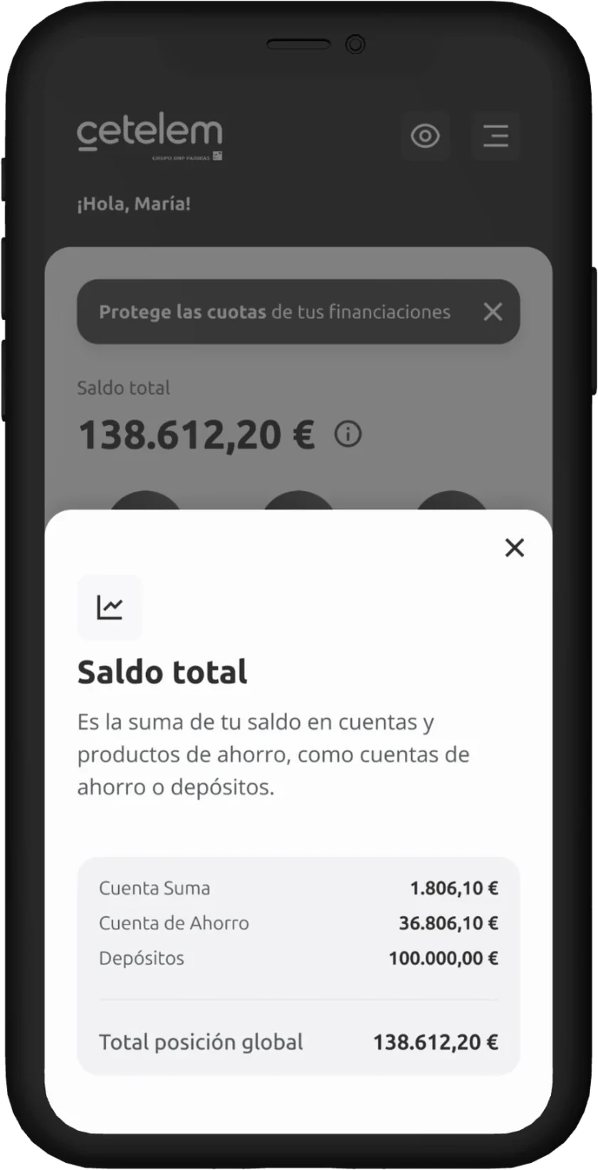
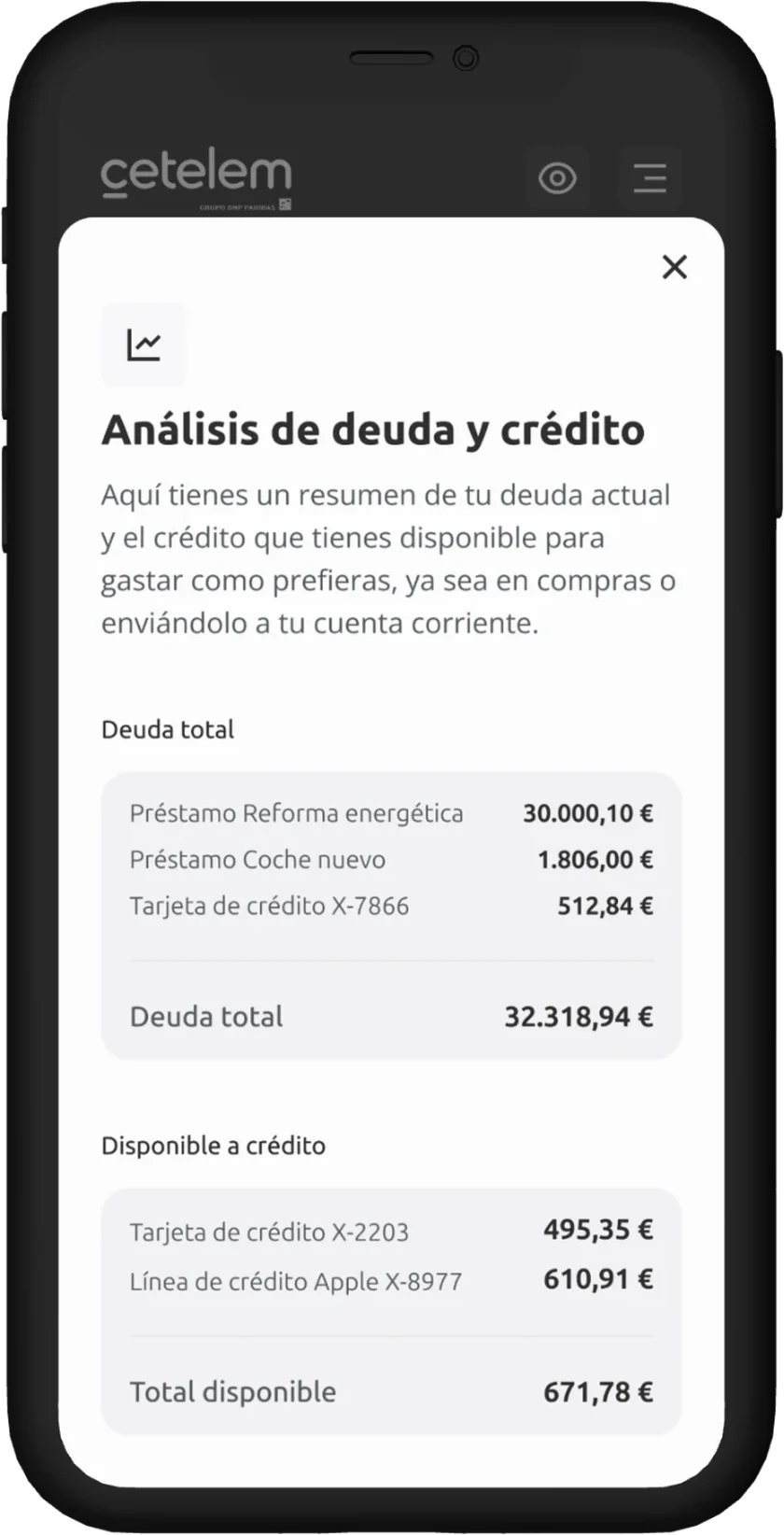
Figures that explain themselves. Total balance and debt analysis are broken down product by product, to understand at a glance what I have and what I owe.
LearningsWhat I take away
- Testing with customers and non-customers gives two complementary perspectives: those who know the current app and those who come in without references.
- Bringing every business area to the table from discovery helps balance commercial goals with clarity for the user.
- Iterating on prototypes before development is much cheaper than fixing a poorly planned structure in production.