
Education
SM Aprendizaje platform and ecosystem
A multi-role learning platform for the publisher SM: from scattered digital products to a unified ecosystem.
- Client
- Grupo SM
- My role
- UX / Product Designer · project lead
- Users
- Teachers, students and families
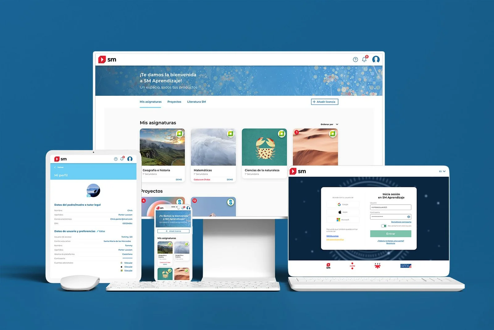
The challenge
Bringing scattered digital products together into a single platform for teachers, students and families.
The key
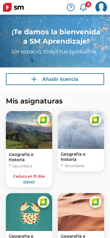
Organizing content into three levels, with the subject as the entry point and the card as the atomic piece.
The result
A single ecosystem across every device, with shared access and a shared visual system.
The problemWhat does each role see the first time they log in?
Each SM digital product had been developed separately, which created friction for both users and the business itself.
The new platform had to serve three profiles with radically different needs (teachers, students and families) and a very wide range of content: digital textbooks, supplementary resources, licenses and classroom management tools. The challenge wasn't just information architecture but also prioritization.
ProcessHow we did it
I led the project from start to finish, coordinating with SM's product team and with development during implementation.
Requirements
Defining the scope with the business areas.
Benchmark
Learning and content management platforms.
Workshops
Co-creation with stakeholders to share design thinking.
Architecture and flows
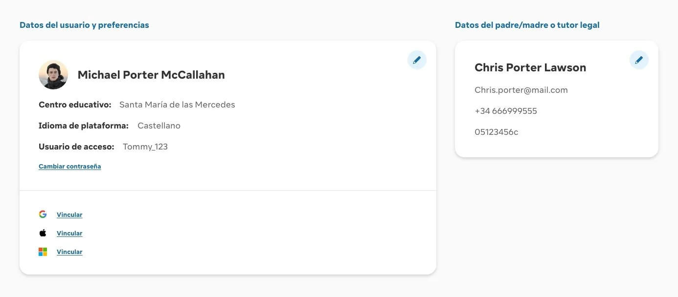
Access by role, licenses and levels of depth.
Unmoderated testing
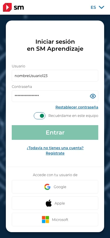
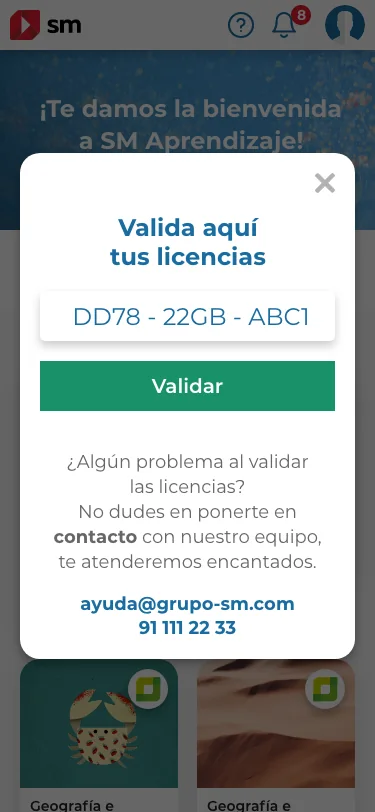
Registration and license validation.
Final UI
A shared visual system for all products.
What we foundKey findings
- The subject is the entry point. Teachers and students think first about their subject, not about the type of product behind it.
- Activating a license was confusing. Unmoderated tests revealed specific comprehension problems when validating a license.
- Each role comes in with a goal. Teachers, students and families need to see different things, so content priority changes by profile.
The solutionAn ecosystem organized by subject
The use-case analysis produced three decisions that form the backbone of the whole ecosystem.
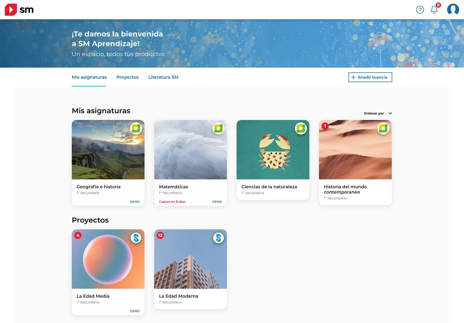
Three levels of depth. The first shows the user's subjects; the second and third give progressive access to supplementary materials.
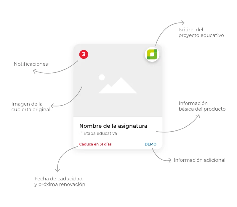
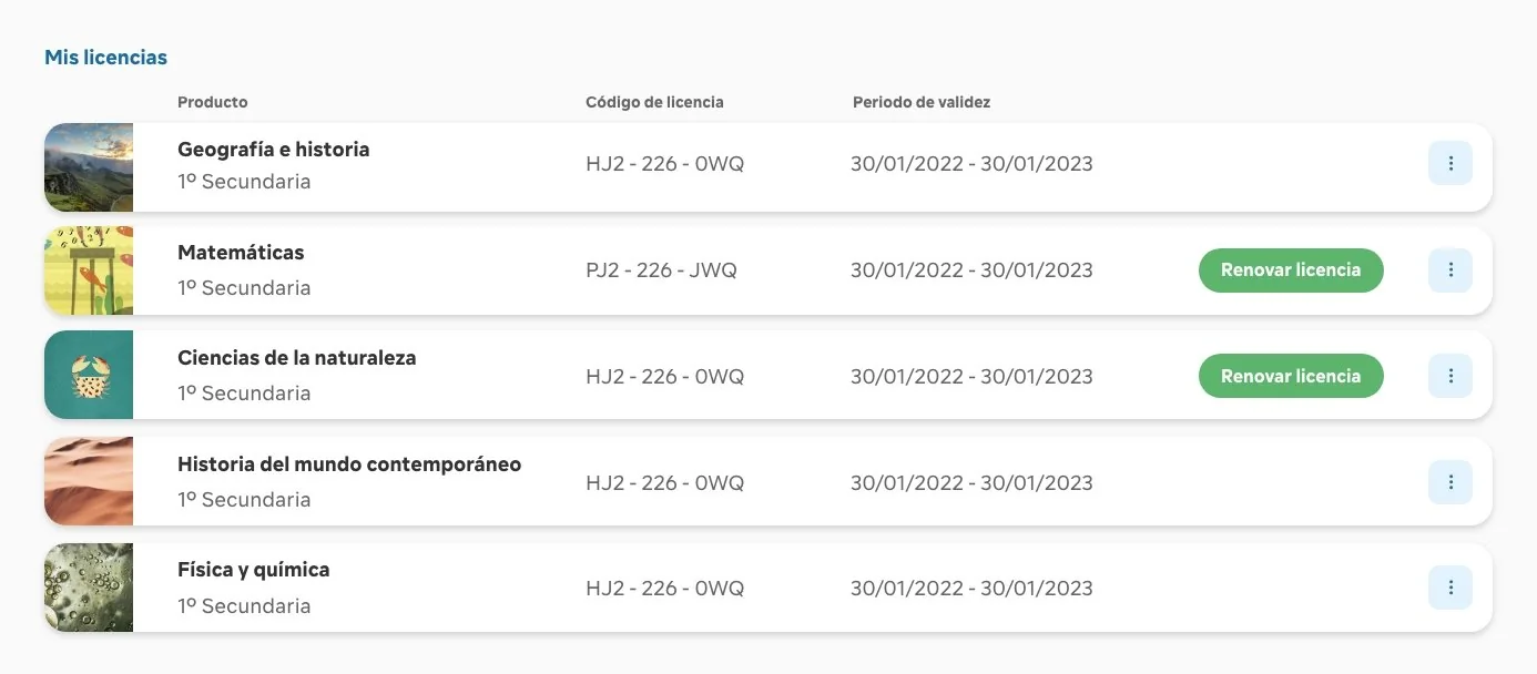
The card as the atomic piece. It condenses the essentials of any product (title, type, license status and direct access) and, grouped together, forms a grid that's easy to browse and filter.
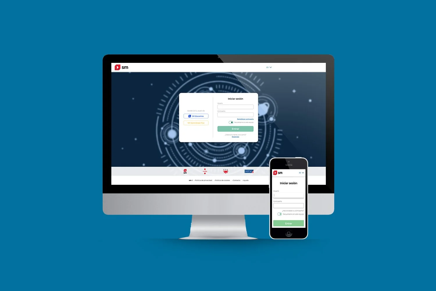
A clearer onboarding. We redesigned registration and license validation to reduce cognitive load and explain what a license is to non-technical users.
LearningsWhat I take away
- Deciding what each role sees first simplifies every other decision: prioritization matters as much as architecture.
- A well-defined atomic piece brings coherence to very different kinds of content.
- Workshops with the business make design something everyone owns, not just the UX team.