
Education
Revuela, SM's new digital publishing project
The textbook turned into an interactive digital product for students and teachers, in the classroom and at home.
- Client
- Grupo SM
- My role
- UX / Product Designer
- Users
- Students and teachers, basic and premium
The challenge
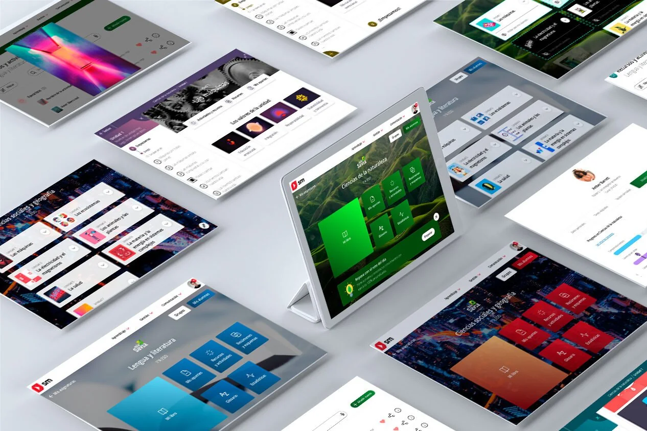
Bringing the textbook into the digital environment with a flexible framework for every type of user and every country.
The key
Many users weren't very comfortable with technology, and it was often the teacher who projected the book in class.
The result
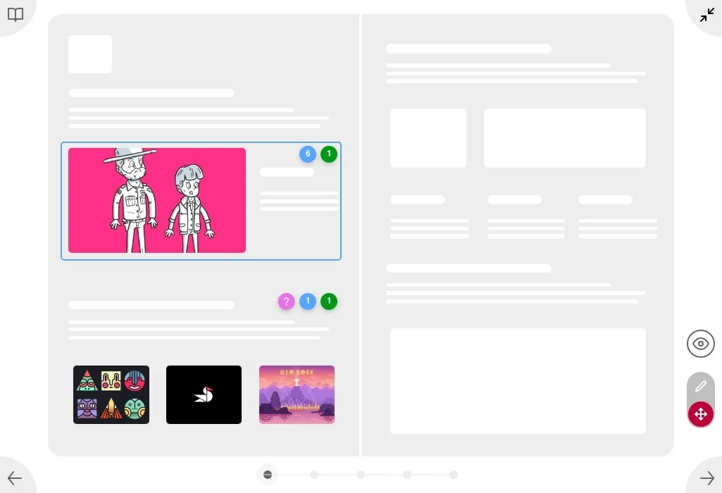
Navigation in five sections and an interactive viewer designed for projecting in the classroom.
The problemFlexible for everyone, in every country
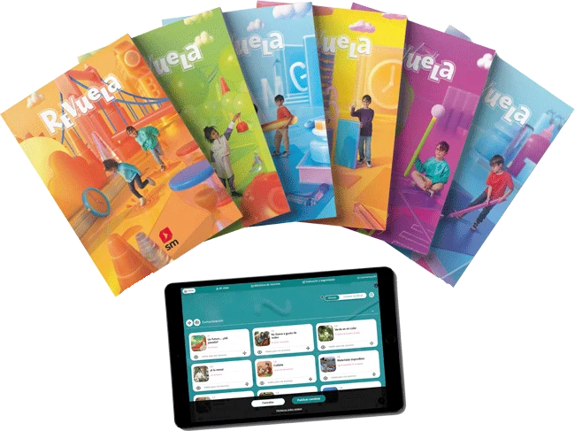
Anticipating Spain's new education law (LOMLOE), SM wanted to turn the classic textbook into an interactive digital product for working and learning in the classroom and at home.
It had to be flexible enough to serve every type of user (premium or basic, student or teacher) and work as a framework so that every country in the group could use it with its own educational content.
ProcessHow we did it
I was involved in every phase, from concept development to user testing.
User models
Priority profiles and their needs.
Benchmark
Platforms with similar features.
Prototypes
Low fidelity to test navigation and features.
Usability testing
The key features, with several techniques.
UX improvements
Redesign of the most problematic flows.
What we foundKey findings
- Low-to-medium tech profile. Most users weren't very comfortable with technology and, in many cases, had limited access to it.
- The teacher projects in class. Students often had no devices in the classroom: content was shown on the interactive whiteboard.
- Too many options overwhelm. With so many features, the first decisions had to be made among very few elements.
The solutionDesigned for the classroom
Every decision responds to how the book is really used in the classroom.
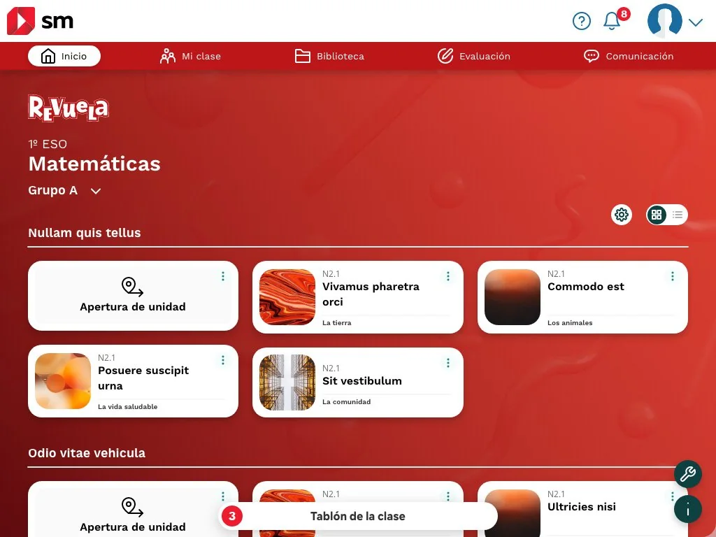
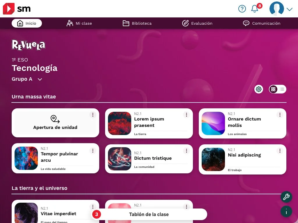
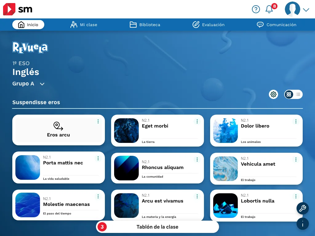
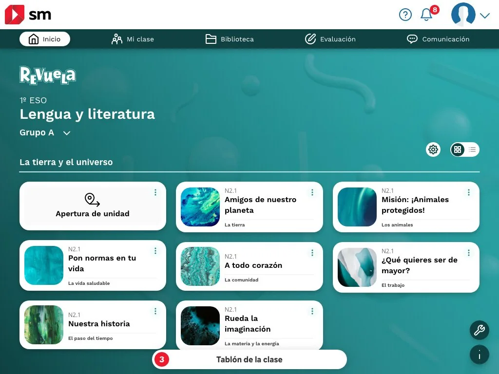
Five main sections. Home, My class, Library, Assessment and Communication: the whole platform is organized from a very short main navigation.
A viewer designed for projecting. The teacher shows the digital book on screen or on the whiteboard, with the interactive elements always at hand to use with the class.
The same structure for every subject. All units share the same card system, with its own color per subject to find your way at a glance.

LearningsWhat I take away
- Understanding the real context of use changes the product: knowing that the teacher projects in class led us to the viewer.
- Reducing the first decisions to a few elements helps people with little experience of technology.
- Designing a flexible framework, rather than a closed product, lets each country adapt it to its own content.